Breaking the rules of packaging design
“Consumers owe you nothing, you owe them everything” and “If it ain’t broke, then break it”. Rowland Heming immediately got our attention at STIMA’s BrandCafé. It comes down to this: it’s not because you put a lot of time and effort in developing and marketing a product, that a consumer is obliged to buy it. You should rather look through the eyes of the consumer and try and understand what he thinks about your product, your packaging.
One single supermarket sells thousands of products. A consumer simply cannot see them all and automatically deselects 80% of all available consumer goods. How do you make consumers notice your product? According to Rowland Heming, you should get to know the rules and then break them. Be different. Stand out.
1. Visual communication is a natural and global language
We all have to learn how to read and as we all speak different languages, we can state that text and words are local communication tools. Visual communication on the other hand is something we know instinctively, it’s a global language. When shopping for groceries, consumers recognize visual cues in this order: color, shape and logo style.

Point proven, no?
Colors are a very strong communication aspect. They can express flavor, gender, power, health and so much more. Think about the new Coca-Cola Life, why do you think it’s green? Furthermore, colors also have the power of standing out and creating a block on the shelf, something that Activia understood very well when they created a green pot next to all the blue ones.
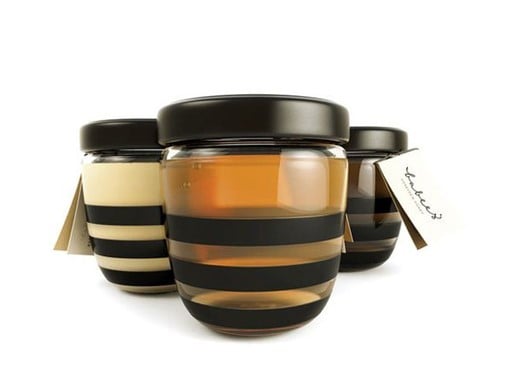
2. Less is more
Only communicate the essence. 2 out of 3 consumers already know what they want. Your packaging design needs to help them find you quickly and easily, because you don’t want your consumer to start looking for another brand. It only takes them a few seconds to browse on.
As the other one out of every 3 consumers has not decided yet, your product needs to attract their attention and convince them to buy and try it. Don’t overwhelm the consumer with reasons to buy and a list of ingredients, benefits or promises. Instead, prioritize and think visually. Use images and tempt the taste buds. Simplify = amplify! Anyone would assume that the jars below contain yummy quality honey!
3. The power of personalisation
The power of packaging was once again proven when Nutella started with personalized jars in Belgium in 2013 in order to attract new buyers and strengthen the relationship with its existing consumers. Benoit Cardinael (Marketing Manager Nutella Benelux at Ferrero) explained to us the key elements that turned the campaign into a success.
- Local touch: by adapting the names on the Nutella jars – not only to the country, but even to the regions – Nutella managed to localize a global campaign.
- Emotionality: they used their vast fan base to spread the word and make Nutella an even more emotional product than it already was. The emotionality of the campaign was intertwined in all communication.
We are very curious to see if the new limited edition will have the same effect…